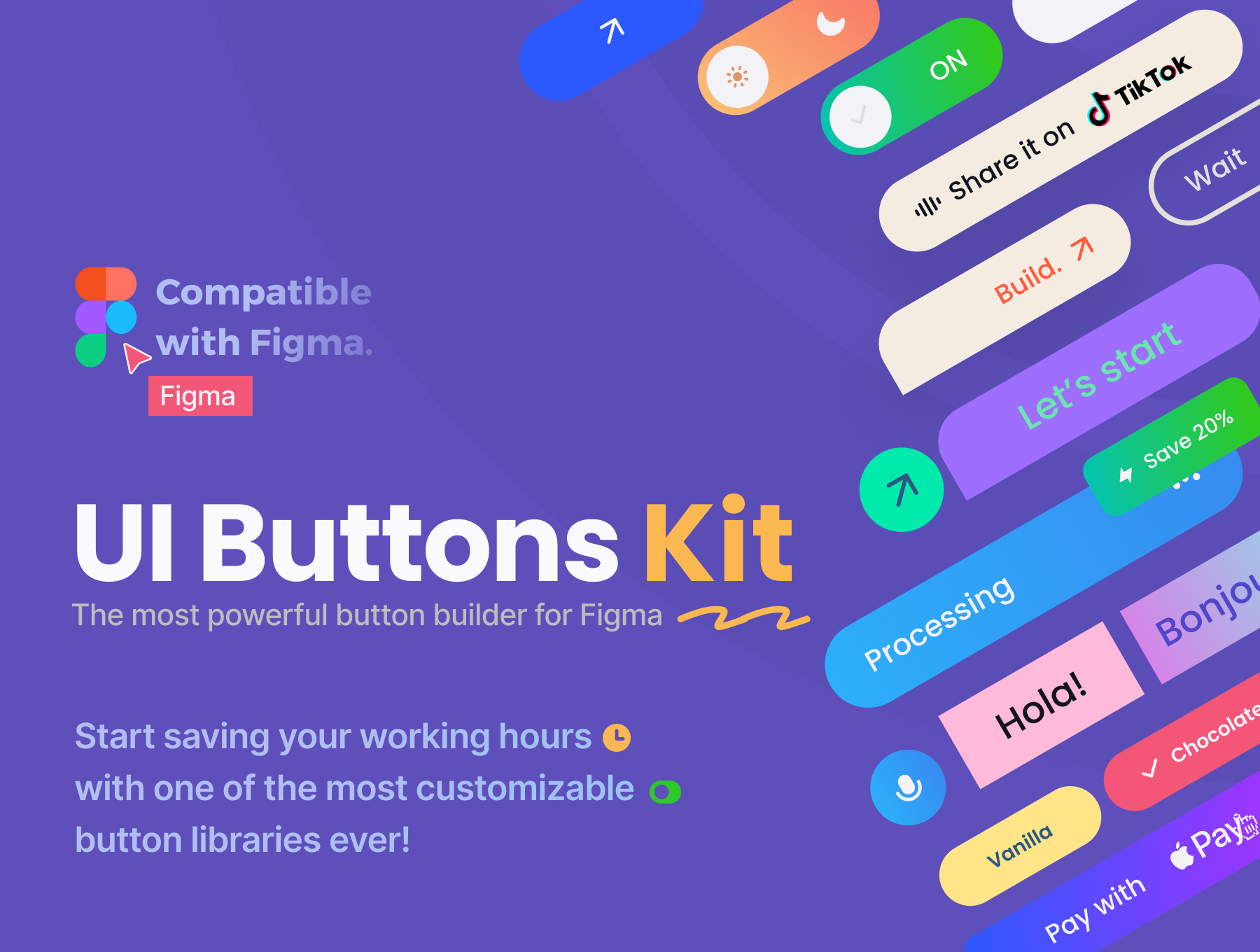
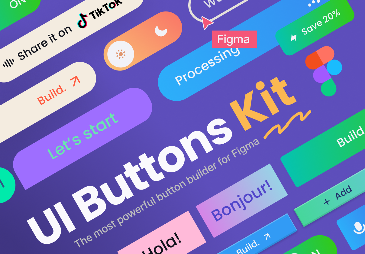
This collection features the most popular and commonly-needed buttons for Figma.
It utilizes auto-layout, component properties, variants, and interactive components to simplify your button design process.
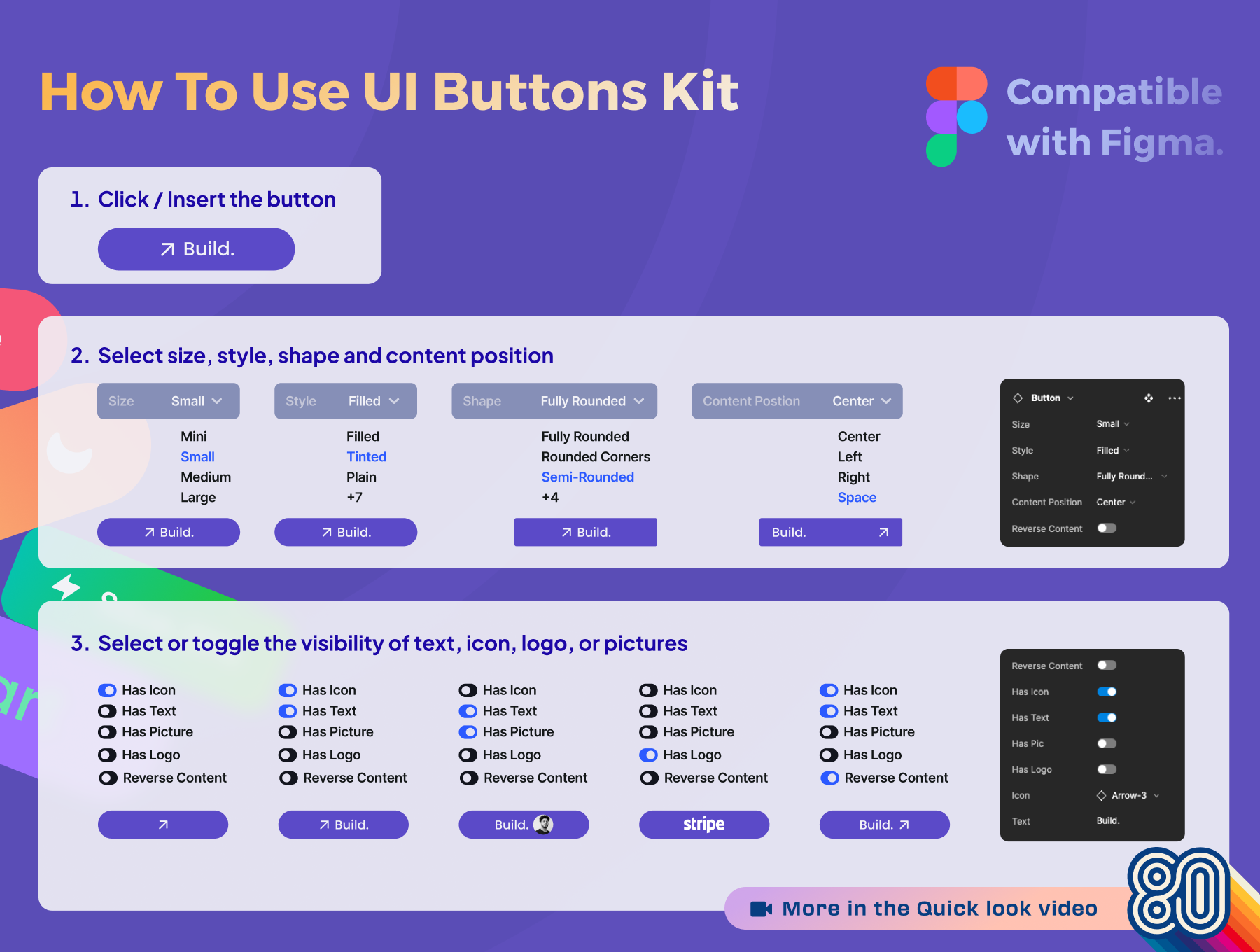
You can easily change the button's size, style, and shape, as well as select or toggle the visibility of text, icons, logos, or pictures. Additionally, you have the flexibility to adjust the content position and swap icons directly at an instance level, allowing you to create infinite variations.
Highlights
- Flexible and easy to customize for your design system.
- Support the new component properties, autolayout feature in figma.
- Global Styleguide Included,
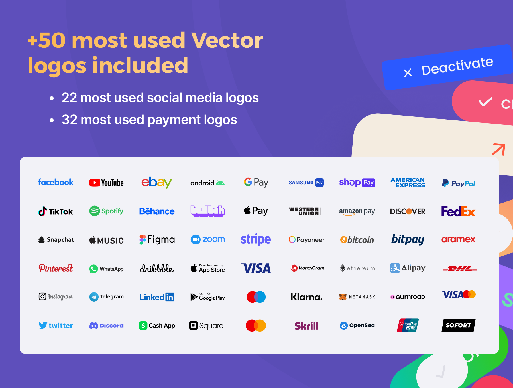
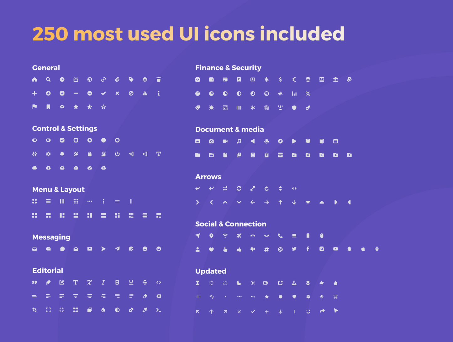
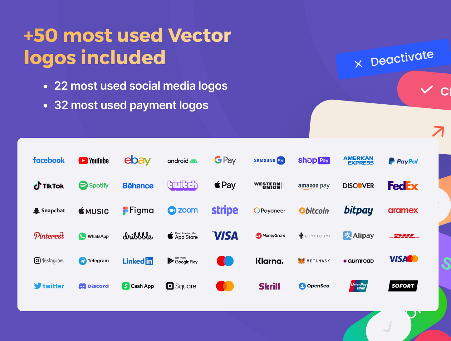
- 250 most used UI icons, 50 most used Vector logos.
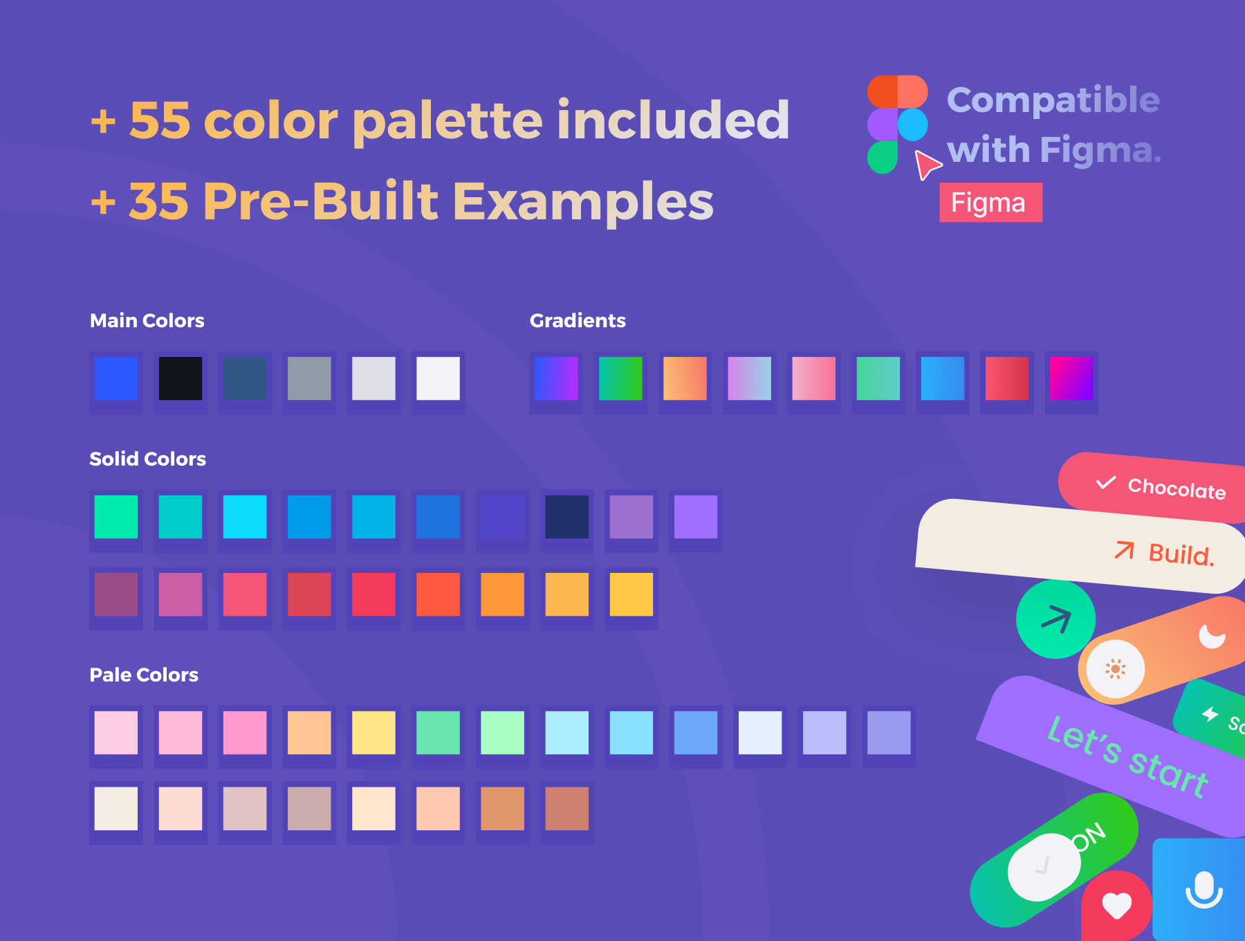
- 35 Pre-Built Examples included, 55 color palette and text styles included.
- Well Organized, 100% customizable, Fully Editable.
🔥
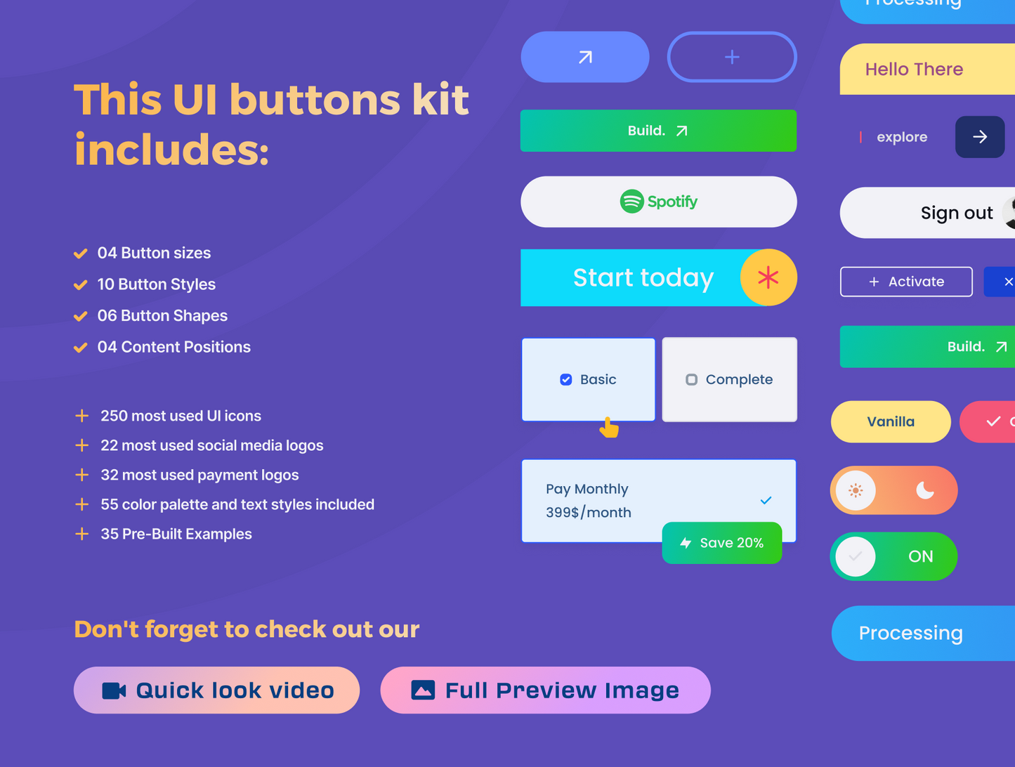
This UI buttons kit includes:• 04 sizes (Mini, Small, Medium, Large)
• 10 Styles (Filled, Tinted, Plain, Gray, Stroked, Pale & Shadow, Background Blur, 80s Style, Gradient, Mix)
• 06 Shapes (Fully Rounded, Rounded Corners, Semi-Rounded, Sharp Corners, Half Rounded, Bubble)
• 04 Content Positions (Variants) (Left, Right, Center, Space)
• Has Icon (boolean toggle)
• Has Text (boolean toggle)
• Has Picture (boolean toggle)
• Has Logo (boolean toggle)
• Reverse Content (boolean toggle)
+ 250 most used UI icons (BeBold Essentials UI Icon)
.
+ 22 most used social media logos (Vector)
.
+ 32 most used payment logos (Vector)
.
+ 55-color palette and text styles included.
+ 35 Pre-Built Examples.